Float House is a Vancouver-based alternative therapy spa and sauna that offers three types of services: hot-cold therapy, float therapy, and infrared sauna. Through our user research, we evaluated and delivered a report of our findings which Float House would later implement aspects of within their own website.
This project was completed as a senior-level design evaluation course. I was a UX Researcher in charge of conducting a heuristic evaluation, usability testing, wireframing, and prototyping to analyze the usability of the current website.
Year
2023
Role
UX Researcher, Prototyper
Team
Sam, Jasper, Cherie, Kelly

Context
Establishing the purpose of this study
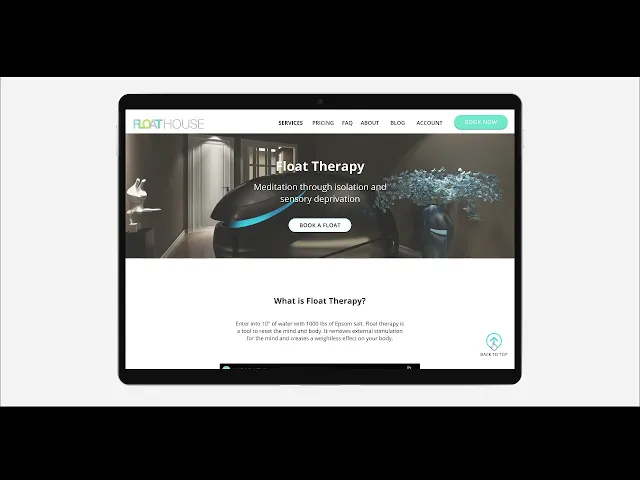
Float House recently went through an interface revamp of their website. Based on this information, we examined the user booking experience for first-time visitors and the overall first-timer user flow.
We aimed to identify the current issues of the website for new users and implement interventions to create a better user experience by utilizing two assessment methods:
Heuristic Evaluations
To familiarize ourselves with the Float House website, the team did a heuristic evaluation as first-time users of the site.
Think-Aloud Tests
All participants performed think-aloud tests to get a better understanding of the users thoughts while navigating the website. We had 2 different test groups (both groups never seeing the website beforehand)
Group A
tested the original website as a first-time user
Group B
tested the prototype website with our newly made improvements as a first-time user
Research Methods
Applying a heuristic evaluation
Never seeing the Float House website before, I focused on evaluating the process of learning about the offered services, booking an appointment and its preparation, and cancelling any upcoming appointments.
Issues I noticed:
Confusing booking selection
Clicking a date when booking an appointment selects the full week rather than a specific day to search for availabilities.
Inaccessible account details
The ability to check account information, bookings, and payment history is difficult to find.
Lack of system feedback or confirmation
The cancellation process is hidden within the booking details, making it hard to recover from booking errors.
Poor accessibility
Poor contrasts makes it tough to read large sections of the site. Reliance on video also limits the accessibility of instructions.
Testing the usability of the existing website
I conducted 5 out of 7 think-aloud tests. During the test, participants were asked to explore the services offered as well as the booking and cancellation process to gain more insights on the first-timer user flow.
Synthesizing the data
Our team conducted affinity mapping to establish the common themes for areas of improvement. After organizing the qualitative data, we focused in on 4 common core issues our participants had.

Insights from the Think Alouds
Unexpected distribution of information
Individual pages felt incomplete with a lack of content
Information that should belong in the services page is detached on the FAQ page or a specific benefits page
Too much scrolling for little reward
All test participants pointed out that there was too much scrolling
Rather than scrolling being an inherent issue, it became an issue when they're scrolling past uninformative images and graphics with no informational reward
Few interactions on the First-Timer Button
The button is an ineffective way of introducing Float House to new users
A majority of the users who we tested did not interact with it, and those who did felt like the information it provided was lacking or poorly presented
Difficulty viewing and cancelling bookings
Confirms our own findings from the heuristic evaluation
Our tested users came to the conclusion that the only way to cancel was to call
“I have to endlessly scroll before I get any information that seems somewhat important or helpful, it’s painful”.
Participant 5
Solution
We prioritized the usability of the first-timer user flow by
Improving the navigation to the account details
A direct account tab in the navigation bar was added. This allows users to efficiently login and access important information such as upcoming appointments and personal account details that need to be updated.
Consolidating services page information
Through copywriting and layout adjustment we were able to reduce the scrolling load to get important information. The added FAQ section and sticky legend for each service also helps users efficiently discern any holes in their understanding.
Providing upfront booking confirmation details and next steps
These changes allow users to easily change their booking while also ensuring they are prepared with the items and waivers required to go into their appointment.


Testing and results
Testing the usability of the prototype
After completing the prototype, I conducted 5 more think-aloud tests with new first-time users of Float House’s services. Participants were given the same tasks and instructions as group A to ensure the validity of the study.
Insights from the user testing of the prototype
Users liked the layout of the information
They felt well-informed just looking at the services page
The booking and cancellation processes were straightforward and easy to understand
Having the FAQ in the services allowed users to feel more informed
looking at the FAQ page made them wonder if they have already read the questions before
First-time users want more pictures to help them understand the establishment and the services better


Takeaways
What I learned
From this project, I learned the importance of ensuring user testing is well organized and prepared before going into these sessions. By having pre-test questions, post-test questions, and specific tasks outlined, it provided an easier experience for the user to speak freely with their concerns, while additionally, avoiding confusion. Moreover, I gained the experience of A/B testing and how effective it can be to test and compare different versions of websites or apps in order to evaluate better user experiences.
Things to still work on
While the FAQ page in the services tab allowed users to feel more informed, it also made the users looking at this page wonder if they have already read the questions before. Thus it could use more refining. Another thing that could be improved on is the usage of pictures. The first-time users who tested the prototype expressed a desire for more images to help them understand the establishment and extent of Float House's services.