Founded by creative lab, Anonymous, A Design Film Festival looks at design and its subculture through the lens of film. With different themes and films screened every year, the festival targets both industry insiders and general viewers, giving them a glimpse of various design practices, stories, and processes.
Year
2024
Role
Lead Visual Designer, Interaction Design, Prototyping
Team
Natalie, Lauren, Sylvia

Context
This project was completed as a visual and interaction design study for a senior-level design course. Within a span of 3 weeks, I experimented with graphic qualities and principles to develop a visual identity and art direction. 2 weeks were then spent on creating an expressive microsite for the festival.
Problem
How might we make visitors reflect on the festival theme of “on a scale of art to design” and engage more with these design sub-cultures?
The range of creative disciplines are complex for both industry insiders and the layman. By curating exclusive content that offers deeper insights into the film’s subject,
Attendees are:
engaging with a spectrum of creative work
reflecting and sharing personalized thoughts
Increasing the connection to the festival enhances the post-show experience. This leaves visitors feeling enriched and eager to return
Highlights niche areas of art and design while also making it more approachable and familiar.
Creates room for conversations, broadening perspectives for the creative community.
Solution Highlight
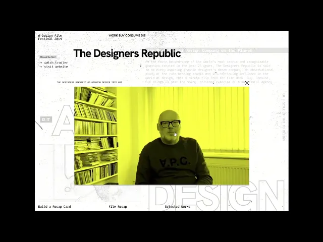
The 2014 edition of the festival looks into the question of “Is it art or design?" and through this theme, it spearheaded how we would strategize the content for the microsite.


Process
My Role:
I led the art direction and visual identity for the microsite which drove how we would incorporate the interactions to balance between expressiveness and functionality. Various iterations of graphics were made before settling on the finalized line of investigation. I then made other assets to support how this direction would be applied to other mediums through tablecloths, program scheduling, and wayfinding.


Forming a visual language
This direction focused on transparencies to connect images under a new perspective and scaling for heavier contrast. Images are colour treated in greyscale and outlined in order to invoke a distinct film effect. Hanken Grotesk is a thinner font, making it clean and legible for further balance to the composition. Kode Mono is a unique monospace aimed to offer intriguing contrast to Hanken Grotesk.

Translating to digital
We explored 3 different sites which ranged from functional, semi-expressive, and most expressive. After gathering feedback from our peers, we went with the most expressive iteration because it left a greater impact with a meaningful post-festival experience.

Understanding the touchpoints for a meaningful festival experience
Within the final microsite, I helped prototype the film recap pages. Being content driven, they contained interviews and further information that helped dissect the creative work the film showcases. The added context ensures visitors are left getting the nuances and extra intricacies that may have been missed or not fully explained from the films they watched.
These pages play a critical role in users obtaining the information needed to determine how it connects to both art and design.

Takeaways
Developing graphic design skills is a matter of increasing your batting average
It’s inevitable to swing and miss, but only then will you grow and get better with more practice!
Content should be upfront and not challenging to uncover
Interactions should be intuitive and not hard on the user. Don’t design based on coolness if it’s making a confusing experience.